The latest desktop update blurs the lines
Last week, Google began rolling out a new look for its search results on desktop, which blurs the line between organic search results and the ads that sit above them. In what appears to be something of a purposeful dark pattern, the only thing differentiating ads and search results is a small black-and-white “Ad” icon next to the former. It’s been formatted to resemble the new favicons that now appear next to the search results you care about. Early data collected by Digidaysuggests that the changes may already be causing people to click on more ads.
The Guardian’s Alex Hern is one of many commenters to point out the problem, noting that there’s now next to no visual distinction between ads and search results. “There is still, technically, *labelling*, but it’s hard to escape the conclusion that it is supposed to be difficult to spot at a glance where the adverts end,” he tweeted.
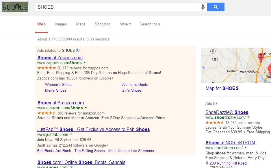
It’s especially striking considering how distinct Google designed its ads in the past. Up until 2013, the search engine gave its ads an entirely different background color to distinguish them from its organic search results. But even after that, it continued to use unique colors that effectively let users quickly see where its ads ended and organic results began.

In a blog post announcing the new design when it came to mobile last year, Google partially explained the change by saying that adding favicons to organic search results means that “a website’s branding can be front and center,” which means “you can more easily scan the page of results.” But it spent far less time talking about the changes to its ad designs, which now feel much more significant, especially when viewing results on a laptop or monitor.
In the past, Google’s Sundeep Jain justified simplifying the company’s ad designs by saying that a simpler design “makes it easier for users to digest information,” according to Search Engine Land. He added that the company was trying to reduce the number of different colors used on a page in order to bring a little more “harmony” to the layout.
Google says a simpler design “makes it easier for users to digest information”
It’s hard not to get the feeling that this “harmony” is less about offering a better user experience, and more about helping Google’s ad revenue. As Digiday reports, there’s data to suggest that’s actually the case. According to one digital marketing agency, click-through rates have already increased for some search ads on desktop, and mobile click-through rates for some of its clients increased last year from 17 to 18 percent after similar changes to Google’s mobile search layout.
Google is fundamentally an ad business. In the third quarter of 2019, Google’s parent company Alphabet made nearly $34 billion from Google advertising, out of a total revenue of $40 billion for Alphabet as a whole. At that sort of scale, small changes in ad click-through rates could end up having a huge effect on Alphabet’s bottom line, even if it means tricking users for cheap clicks.


![Hotstar Premium Cookies 2019 [*100% Working & Daily Updated*] Hotstar Premium Cookies 2019 [*100% Working & Daily Updated*]](https://tahav.com/wp-content/uploads/2019/11/Hotstar-Premium-Cookies-Free-100x70.jpg)


